Screenshot 2023-05-18 at 2.09.29 PM.png

Snapchat Originals

Snap Originals are Snapchat’s premium made-for-mobile shows. The seasons are anywhere from 8-12 episodes long and all episodes ran for under 10 minutes. Originals are regularly featured on the Discover Feed, with around 2-3 shows dropping a month. 

The goals for Originals varied across teams but overall we wanted to get as many unique viewers into the show, for as long as possible. For the users, we wanted to drive awareness and excitement about Originals overall but also provide a premium viewing experience and expose them to mobile first storytelling.

One of the shows I worked on and wrote the UI content for was “Ryan Doesn’t Know”. This Original centered around celebrity Ryan Reynolds and each of the 12 episodes featured him learning a new skill or hobby.

I typically worked alongside an Originals lead who handled uploading, scheduling, and anything directly with the production company. I utilized my deep knowledge of Discover feed best practices combined with the tone and voice of the specific show and infused that into our user’s world. Every tile (entry point) had to be compelling and scroll stopping. In addition to working alongside the Originals lead, I worked with design to identify imagery that would work best to drive click through. 

Celebrity driven shows have historically performed well on Snapchat. In addition to Will Smith and Ryan Reynolds, we also produced shows with Nikita Dragun, Tekashi69, and Bhad Bhabie. Snapchat users love celebrities, but they especially love those who are of the moment. Using Ryan Reynolds as the driver of click through would be a big bet to place, so each piece of UI copy had to add an element of intrigue as well as have it’s own tone and voice that sets it apart from the rest.

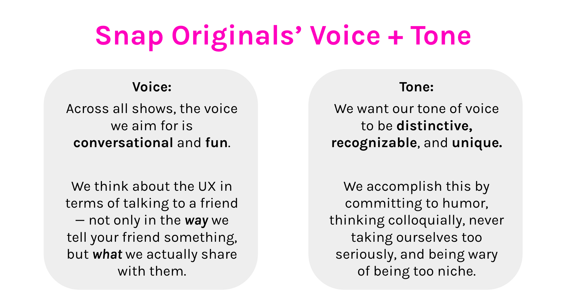
Before writing, I watched edits of the show to understand the tone of the show overall and then I write to it to best supply the most consistent product narrative. The way I wrote for Nikita’s dating show was more playful and had queer tones/language as compared to this show.

Challenges:

The “infinite scroll”: Snapchat’s in-house shows are up against publishers, celebrity gossip and trending moments, celebrities and advertisements. These different products all live together on the same screen and there are very small differentiators between each of them, of which are not always apparent or obvious. This is why UX writing is so important, it informs our user’s app experience. Subscriptions are really helpful for us to get around our infinite scroll, it’s a strong signal that the user wants to stay updated on show episodes and consume more of them. It means that the creative and UI are working. 

There was no data science or research ahead of launches. The only data we had was from similar shows, which I had to use to inform the copy. I analyzed a combination of unique users, time spent, and click through rate. Since I owned the entry point, I wanted the highest amount of uniques and click through rate, but you can never look at those metrics alone. I could write something salacious or click-baity to get them in but it wouldn’t do us any good to get them in and then have users swipe out immediately. I focused on metrics that have a strong combination of all three metrics.

For this episode, we garnered 4.3M unique viewers and 280K subscribers 

Here is where we landed when it came to the first episode UI. Even though this may look like content marketing, this is UI writing at Snapchat. Snapchat operates under the vague and cool “if you know you know” guise and content writing plays an important role because it is so rare. These entry points showed up individually in the app, using our A/B testing technology, which parses out each tile for about ~15 minutes each to different user groups and then eventually shows everyone the best performing one based on a combination of click through and time spent. 

The writing for the first episode focused on Ryan as a celebrity but also the interesting thing he was learning: ice sculpting, without giving everything away. Snapchat users are young and any mention of “drunk” will immediately get a bump in click through. The second option focused on a curiosity gap while promising that something will definitely go wrong. 

Since UX writing is not a discipline at Snapchat, my writing often was edited and choices were made by the Originals team based on a number of factors outside of my control. For example, the fourth image is not how I originally wrote the headline. I initially spelled out the name “Ryan Reynolds” and “Will Smith”. I wanted to tease something that happened in the last 2 minutes of the episode. I was hoping that we could increase time spent by doing so but the names “Ryan” and “Will” meant nothing and with this edit, the UI copy became a lot weaker. 

After reviewing the metrics from episode 1, I re-wrote my initial headlines. I included imagery that was clearly of Ryan—up close and emotional as seen in the 1st and 4th options. I also ensured to write a headline that didn’t mention the activity he was participating in at all, in the 4th option. This episode was a visually interesting one, focused on axe throwing. The tone for this show was a cheesy, which is how his humor is played off in the episodes. The first option is corny but playful and teases the activity. 

CTR declined as the series progressed. Once we dug into the metrics, we saw that the show skewed male and re-wrote headlines and chose images to best attract that audience. To write more male-centered, I wrote straightforward content that didn’t rely on anything too descriptive. Due to the activities showcased in the series, some of the imagery wasn’t as compelling as others. For instance, showcasing miniature art as compared to ice sculpture meant that not every tile image was visually arresting. The copy had to do more work in these instances. The best performing episodes included options that didn’t look like anything the user had seen before in a previous episode.

Looking at the data from the season, I would have fought harder for varying visuals from the beginning (which is why I believe it’s important for me to be a part of the production and not just the post-production process). Additionally, I would have leaned less on Ryan and more on intrigue when applicable and the fun vibe of the show. Previous data indicated we should lean on star power but leaning on celebrity for 12 episodes can get stale quick. 

Episodes with the lowest time spent were ones that followed hobbies with less movement and action. While these episodes leaned female, they actually performed worse with females than with males, suggesting the subject matter wasn’t engaging to either gender.

There were no UX writers at Snapchat which meant that I had to advocate for content across all departments, sometimes having to educate people more than once on the importance of language, tone, voice and what it signals to our users, always keeping them in mind and writing for them, empathetically.